zondag 5 mei 2013

Playing with stamps and colors

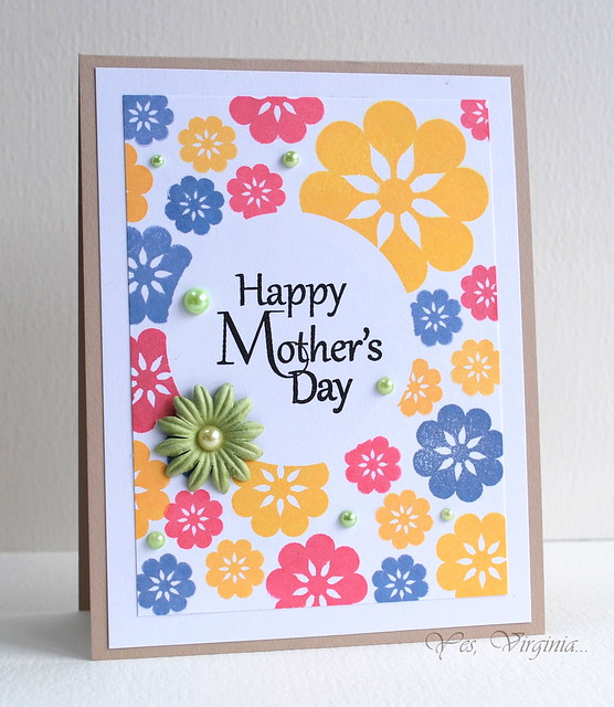
Just a few cards I made while playing with stamps and colors. You can see the sun coming out again!
 Card I made for Marcy's Scramble yesterday. We had to use sunshine or all yellow tones. Just to welcome the sun again.
 
 Last month Hero Arts had a card like this on the frontpage of the blog. I wanted to try coloring this painted flower stamp with distress markers too. Worked out beautifully!
 
This is just a gorgeous color combination. Hero Arts neon green and Navy shadow ink. A simple one-layered card with a fun way of not completely coloring the background. I inked up a solid stamp with the little neon green ink cube, but left a white spot in the middle. That's why you can see the square form of the ink cube, but the color becomes more solid along the edges. I entered this card at the CASology challenge "Care". and at Simon Says "Happy Mail" challenge.

Enjoy!

even the littlest comment is greatly appreciated!

dinsdag 23 april 2013

Colorful Clean and Simple

Today Virginia is guest designer at the Muse Card Club. She made a gorgeous card with bold stamping, bold colors and lovely embellishments.
 
And she still managed to keep it simple! I wanted to enter this challenge and made two cards:
 
At first I thought to emulate her card by stamping bold flowers with primary colors but I came to the conclusion I could never achieve that  fabulous clean stamping. So I dug out softer colors (soft blossom, soft lilac, soft green Hero Arts inks) and started with a little mask. Then I stamped a square stamp all over the card. The colors, blended a bit to much to my liking, but a little doodling with a black pen solved that problem. After a bit of searching I found three buttons, threaded with twine, to finish off the natural feel.
 
When I got my first card finished I wanted to do  a second card with colors appropriate for a man. Straight stamping with a small rectangle stamp (colors: navy, cup o'joe and forever green Hero Arts inks) gave me this look. The banner was cut out and the card finished with some silver dots. I also entered this card at the CAS-ual Fridays Birthday Bash (CFC99) challenge.

You see, clean and simple style doesn't always have to be about lots of white space! It can also mean colorful bold stamping with minimal embellishment!
Enjoy!

even the littlest comment is greatly appreciated!

dinsdag 16 april 2013

Painted Flower

I loved playing with Painted Flower yesterday. Today I used that stamp again, two different ways. Both cards were added to Simon Says "April showers and/or spring flowers" challenge

This one is my entry for Play Date Café #177 with the suggested colors. The design is based on Clean and Simple sketch #236 which has a lot of similarity with the Hero Arts sketch of this month. So I'm entering this card for those challenges too. Today on the Hero Arts blog Lisa showed white stamping on kraft paper, just like Kandis yesterday, and I love that combination!
 
Here I embossed Painted Flower in white and started blending ink colors dried marigold and fired brick over it. Then I stamped the flower again with fired brick distress ink. Looks like the perfect get-well-soon card for a lady! Even though I only used one of the Play Date Café #177 colors here I'm going to enter this card too.

Enjoy!

even the littlest comment is greatly appreciated!

maandag 15 april 2013

Hero Arts Prize Arrived!

Three weeks ago I won a prize at the Hero Arts blog (I was allowed a shopping spree at the Hero Arts online store!) and today the package was delivered! Luckily I have no other obligations this evening so I'm enjoying myself to the utmost with new inks, stamps and gems!

I choose the Painted Flower because I just adore flowers this size. I have a whole collection of them! They easily fit on a card, can be cut out, can be stamped in all kinds of colors. Just so versatile! Background: Tartan background stamped with new white Unicorn pigment ink on kraft paper. The unicorn ink stamps beautifully! A bit of twine and washi tape complete the natural feel of this card.

I also choose a neon ink cube pack. These were a huge hit last year and I wanted to play with them too. Besides, spring is here and summer will follow (hopefully rather sooner than later!) and these bright colors give me taste of summer to come! Painted flower in Warhol-style!

This Dandelion is a stamp I have been drooling over more than once. Don't know why I never picked it up. Now I had the chance and I could not pass it over again. I'm glad I choose it because it is a wonderful simple stamp with so many possibilities! You will be seeing more cards with this stamp from me! Here I used it to create a condolence card (Sadly, we need these cards frm time to time) I stamped the dandelion with my new Navy ink. Fantastic dark blue color! Added a bit of stardust glitter to the fluffies, hope you can see it on the inset picture!

Enjoy!

even the littlest comment is greatly appreciated!

zondag 7 april 2013

Tone-on-tone with Hero Hues

While having fun with solid background I revisited my background stamps and reviewed my Hero Arts inks. I indulged myself with the gorgeous colors and tone-on-tone technique!
 
The complete card set I made this afternoon based on Hero Arts sketch challenge. I found these cute little Dutch sentiments at the stamping event yesterday and I hoped they would fit the different die-cuts. And they fitted perfectly!
 
Left card: "birthday". HA inks: pool and stonewash. Stamps: zig zag background, antique engravings shells
Right card: "get well soon". HA inks: soft leaf and forever green. Stamps: daisy outline pattern (S5472. Sorry, I could find no link to this stamp) and the strawberry from engraved fruits.
After I saw Shari's technique video, I colored the shells and strawberries with water soluble  oil pastels.
 
Left card: "strength". HA inks: soft sand and cup o' joe. Stamps: lace background, butterfly die cut from playful flowers and butterflies.
Right card: "today is your day". HA inks: soft blossom and red royal. Stamps: large flower background. little flower from playful flowers and butterflies. I cut out the large blossom by hand and glued it on the inside of the card, in the lower right corner.
 
Enjoy!

even the littlest comment is greatly appreciated!

New Stamps!

I picked up some new stamps at the Art Specially Event at Zeist. A big solid background stamp from Impression Obession will enable me to make cards like this:
 
Recently I bought a box full of white stamping paper and I was beginning to get a little tired of white all the time. Precolored cards are tiresome because it's never the perfect right color for the inks I have. That problem is now solved! No more mismatched colors! And gorgeous tone-on-tone cards possible! Background stamped with butter bar HA ink and Floating Blossoms (CG147) in soft apricot. Letters were die cut with Parker Lower Alphabet Set.

A card with a faux stitching line (micron 1.0) and partially die cut letters. Background made with Pan Pastel and Real Blossom (K5414)

Yesterday I participated in Sue's Scamble. The challenge was all-white or white/black/silver/grey color combination. This was a wonderful challenge and after the scramble I made a second card. Floating Blossoms embossed in white and the single cut out one in silver.

Enjoy!

even the littlest comment is greatly appreciated!

donderdag 28 maart 2013

Geometric Shapes

Recently I received my order from Simon Says: Hero Arts geometric shapes. These shapes are so much fun and I could not wait to play with them. Luckily I found some nice challenges to get my mojo going! Both cards participate at A Blog Named Hero: freestyle and at Simon Says: Anything Goes. Well, that was easy, wasn't it?
 
I made this card with the Moxie Fab: Pastel Pretties in mind. Love those soft colors! Spring may not be here outside but in the creative world it's definitely here! (Yes, I'm still in love with the cheerful Bo Bunny papers from Paula!)
 
And this card was made with the Moxie Fab: Ombre challenge as inspiration. The shapes just fit perfectly next to each other. And you know the rule: straight lines love dots! Life of the Party dots background made the ombre tag really pop!

Enjoy!

even the littlest comment is greatly appreciated!