donderdag 26 januari 2012

Valentijn - Valentine

In Nederland doen we niet zo erg aan Valentijn. Het wordt ons een beetje aangepraat door de commercie. Ik heb geen speciale dag nodig voor de liefde! Ik vertel mijn man en kinderen elke dag dat ik van ze hou!
Vanavond was Christa hier en we waren een beetje melig. Dus toen de chocolade op tafel kwam kreeg ik ineens dit idee. De kersjes zijn net muzieknootjes!

We don't celebrate Valentine so much here in Holland. Altough the stores sell loads of Valentine products. I don't need a special day for love. I tell my DH and children every day I love them!
Tonight Christa was here and we were a bit gigglish (is THAT a word??!!) So after the chocolate made it's appearance on the crafting table, I got this idea for a Valentine card. The cherries look just like music notes!

Ik heb een klein gedeelte van de kersen stempel van de Engraved Fruits set van Hero Arts gemaskerd met een plakbandje en daarna pas beïnkt. Maskertje eraf en stempelen maar. Het kostte wat moeite maar na drie pogingen kreeg ik dit resultaat. Muziek lijnen erin getekend en wat extra muzikale notaties. Met de witte gelpen wat highlights op de kersjes getekend en een beetje stickles X-mas red aangebracht.. 
I masked part of the cherries-stamp from the set Engraved Fruits from Hero Arts to stamp only one of the cherries. It took a bit of practice but after three tries I got this result. I drew the lines and added some musical extra's. I added some highlights to the cherries with the white gelpen and a little bit of stickles X-mas red. 

even the littlest comment is greatly appreciated!

woensdag 18 januari 2012

CAS homework day 7

Dag 7 ging over een witte kaart. Ik gebruik meestal een witte kaart omdat wit voor mij het ultieme "clean" is maar een heleboel andere kaartenmaaksters gebruiken vaak een gekleurde kaart als basis. Voor dag 7 heb ik dus nog even gespeeld met de "foute kaart" van dag 2. En deze keer is het wel gelukt!

Day 7 was all about plain white cards. I mostly use plain white cards because white is for me the ultimate "clean". But a lot of other artists often use a colored card as base. So I took a plain white card and played with the technique from the "failed card" on day 2. This time I succeeded!
Perfecte embossing, mooie kleuren op de bloem links. Deze keer zijn de kleurverschillen wel acceptabel omdat ik een aquarel techniek heb gebruikt. En een lichte afdruk van de tekst met distress inkt dusty concord. De bloem is de Ruffled Flower van Hero Arts
Perfect embossing, nice colors on the flower left. This time the white and dark spots are acceptable because I used an aquarel technique. And a light sentiment stamp in a matching color distress ink dusty concord. The stamp is the Ruffled Flower from Hero Arts.

I werd geïnspireerd door Play Date Cafe uitdaging PDCC114. Ik zag gelijk een CAS kaart in de chocolaatjes op het witte bord! Helaas is de uitdaging al gesloten dus ik kon niet meer meedoen. Volgende week dan maar weer!
I was inspired by the Play Date Cafe challenge PDCC114. The little chocolates inspired me! The letters form the word "gefeliciteerd" which means congratulations in Dutch. Unfortunately the challenge closed on Tuesday. I could not enter anymore! Oh well, better luck next week!


even the littlest comment is greatly appreciated!

maandag 16 januari 2012

Minimal embellishments

Ik was tussen mijn stempels op zoek naar heel iets anders toen ik deze tegenkwam. Mijn jongste dochter heeft deze set ooit eens uitgezocht. Ik heb geen idee meer van welke designer of fabriek deze stempels zijn!

I was looking though my stamp stash when I found this lovely one. It's from a set my youngest daughter once chose. I have no idea who the designer is or the company!
Maar het hertje gaf me een idee voor een CAS kaart. Simpel en toch leuk. Waarom? Er zijn drie elementen die met elkaar verbonden zijn. Het groene gras, de groene tag. De tekst die met het hertje te maken heeft. En het hertje die in het gras staat. Even twee afgeronde hoekjes om de visuele lijn (van linksboven naar rechtsonder) te nebadrukken. Ik zou nog een heel klein beetje stickles op de rug van het hertje kunnen doen :)

But this lovely deer gave me an idea for a CAS card. Simple and fun. Why? The three elements are connected. The grass is green and so is the tag. The text is about a deer. And the deer is standing in the grass. Two rounded corners accentuate the visual line (from top left to bottom right). I could add a little bit of stickles to the back of the deer :)

even the littlest comment is greatly appreciated!

CAS homework day 6

Vandaag gaat het over embellishments. De extra dingetjes die een kaart zo speels maken. Kristina Werner doet ons een gevouwen bloemetje voor met een inch cirkel pons. Die heb ik niet dus doe ik het met een inch vierkantje pons. De hoekjes heb ik afgerond met een andere pons.

Today it's all about embellishments. Those little thingies that make a card look playful. Kristina Werner gives us an example of a folded flower. She uses an inchie circle punch. I don't have that one, so I used my inchie square punch. I rounded the corners with another punch.
De tekst is de Happy Definition achtergrond stempel van Hero Arts. Omdat mijn bloemetje voornamelijk roze en rood is, heb ik de tekst met distress inkt fired brick gestempeld. Zie je de parel in het bloemenhart? Ik was niet helemaal tevreden over de scherpte van de vouwen, daarom de parel om het te verbergen. De paperclip bovenop is alleen even om de kaart een beetje goed op de foto te krijgen.
The text is the Happy Definition background stamp from Hero Arts. Because the color of  my flower is mostly red and pink I stamped the text with distress ink fired brick. Notice the little pearl in the heart of the flower? I wasn't completely happy with the inside folds, therefor I used a pearl to cover it up. The paperclip on top is there only for the photo, to keep the card closed.

even the littlest comment is greatly appreciated!

zondag 15 januari 2012

CAS homework day 4

Nog één kaartje dan en dan heb ik wel genoeg huiswerk gedaan voor vandaag! Op dag 4 werden we uitgedaagd om één stempel op drie verschillende manier te gebruiken. Dat heb ik niet gedaan maar ik werd wel geïnspireerd door een van de voorbeeld kaarten waarop een transparantje werd gebruikt. Ik heb dezelfde stempel gebruikt om de bovenrand wat op te leuken. Zelfde stempel, anders gebruikt!

One more card for today and then I think I did enough homework! On day 4 we were challenged to use one stamp in three different ways. I didn't do that but I let myself be inspired by one of the example cards using acetate. I used the same stamp to embellish the top edge. Same stamp, used in a different way!


Klein detail. Op het transparantje in wit gestempeld en drie blingetjes gelijmd.
Small detail: stamped on the acetate with white and glued three gemstones under the sentiment.

even the littlest comment is greatly appreciated!

CAS homework day 2

CAS=Clean and Simpel. Nou soms is het niet zo clean en niet zo simpel! De truuk met CAS is dat het LIJKT ALSOF het zo GEMAKKELIJK is. Veel wit en licht en perfekt gestempeld. Och, het is zoooooo gemakkelijk ... NEE hoor!!

CAS = Clean and Simple. Well, let me tell you, sometimes it's not so clean and not so simple!! The trick with a CAS-card is making it LOOK LIKE it's such an EASY card. Clean an bright and perfect stamping, oh, it's sooooo easy ... NOT!!

Hier is nou een perfect voorbeeld van een goed idee met absoluut foute details. op het eerste gezicht is het een prachtige kaart, ik zal de eerste zijn om dat toe te geven. Maar de uitvoering is COMPLEET ongecontroleerd! Zie je de embossing rechts? Stukjes van de lijn weg en puntjes embossing poeder die aan het papier bleven kleven. De inkblending op de linker bloem her en der oneven: lichte en donkere plekken. En om het af te maken heb ik de tekst stempel te hard op het papier gedrukt. De lijnen zijn te dik geworden. Het idee is goed maar dit moet ik zeker overnieuw doen! Ik zou me schamen als ik deze kaart zou sturen!
And here is a perfect example of a good idea gone absolutely wrong at every detail. At first glance it's a charming card and it is! I'll be the first to admit that. But the execution is TOTALLY out of control. See the embossing on the right? Pieces of the line missing and spots of embossing powder sticking to the card. The uneven inkblending on the left flower? And, to top it off, I pressed the text to hard on the paper. The lines are too thick. The idea is a good one but I have to do this again. I would be ashamed if I had to sent this card!

Nou dit is beter. Verschillende structuur stempels met masker papier door elkaar gestempeld. Op een perfekt vierkant en met 3d-blokjes verhoogd opgeplakt. Een kleine tekst eronder omdat de structuren al druk genoeg zijn. En drie glimmertjes om het geheel op te leuken.
This is better. Different background structures, stamped in shapes with masking paper. Cut to a perfect square en raised of the white card with dimensional glue. A small text underneath because the structures give interest enough. And to finish it off three blingstones for a little shine.

even the littlest comment is greatly appreciated!

CAS homework day 1 and 5

Zondag, geen bezoek, niks gepland, lekker tijd om te oefenen met CAS-huiswerk! Op dag 5 gaf Jennifer McGuire een les over "technieken simpel maken". Ze liet zien hoe je simpel een soort aquarel effect kan bereiken met inktsponsjes en inkt op waterbasis.

Sunday, no visitors, no plans, time to practice and do my CAS-homework! At day 5 Jennifer McGuire gave a lesson about "techniques made simple". She showed us how to do a kind of aquarel colorblocking with inkblendingtool and waterbased ink.
Ik heb hier (v.l.n.r.) distress inkt victorian velvet, barndoor red en adirondack shell pink gebruikt. En daarna de roos van Art Journey in dezelfde kleur er overheen gestempeld.
I used (left to right) distress ink victorian velvet and barndoor red and adirondack shell pink. After that I stamped the rose from Art Journey in the same color.

Dit is mijn inzending voor de Art Journey uitdaging "Perfect Pearls" Want de inkt is aangelengd met perfect pearls en water uit de minister voor een mooie glans.
This is my entry for the Art Journey challenge "Perfect Pearls". Because the inkt is mixed with perfect pearls and water in a minimister for a beautiful shine.

Hier mijn eigen ideetje. Een kleur inkt (barndoor red) en een rond masker. Ik ben er niet helemaal tevreden over, maar de techniek is leuk om te doen. Ik heb een paar dauwdruppels aangebracht met een transparante gel pen. Helaas pikt de foto het niet goed op; de inkt is gemixed met white pearl water uit de minimister. Er zit een prachtige glans over.
Here I tried a different approach. One color ink (barndoor red) and circle shape. I'm not completely happy with it, but at least the technique is fun to do. I did use aquarel paper and I added some transparent gelpen dewdrops, which will take a few hours to dry. Unfortunately the photo doesn't show it; the ink was mixed with white pearl water from the minimister. It has a gorgeous shine.
En als laatste nog een kaart volgens een schets van de 1e dag. Het was de bedoeling om diepte aan te brengen in de verticale lijn. Ik heb een zigzag gemaakt met de Large Canvas Stripes van Hero Arts. Het bloemetje is van de Tattered Florals snijmal van Tim Holtz. Structuur op het bloemetje is wit geëmbossed Diagonal Dictonary Type, ook van Hero Arts.
And last a card according to a sketch from day 1. We had to create depth on the vertical line. I made a zigzag pattern with Large Canvas Stripes from Hero Arts. The flower is from Tattered Florals die from Tim Holtz. Structure on the flower was made with white embossed Diagonal Dictonary Type, also from Hero Arts.

even the littlest comment is greatly appreciated!

vrijdag 13 januari 2012

Clean and Simple Online Card Class!

Nou heb ik het gedaan! Ik heb me aangemeld voor de Online Card Class "Clean and Simple"! Die stijl trekt me toch steeds meer en ik hoorde allemaal goede en leuke verhalen van mensen die meedoen. Dus heb ik de sprong maar gewaagd en me ook aangemeld. Nou, het is zeker de moeite om er eens aan mee te doen hoor! Allemaal tips en truuks om CAS kaarten te verduidelijken en makkelijker te maken. Hier zijn mijn eerste pogingen om mijn huiswerk te doen:

Now I've done it! I signed on with Online Card Class "Clean and Simple"! I've always loved the CAS-style but I have trouble making a CAS-card "work". Why is one idea good and another absolutely worthless? In class I get all kinds of tips and tricks why some things work and why others don't. And there areseveral example cards to practice with. Here are my first attempts of doing my homework :
Dit is mijn versie van een schets op dag 1. Je hebt waarschijnlijk al meer van deze kaarten gezien, maar ik vond de schets zo leuk dat ik hem ook wilde proberen.
This is my version of a sketch on day 1. You have probably seen more of these cards, but I loved the sketch and wanted to try it.
Deze is een CASE van een voorbeeld kaart. Ik moest wel wat stempels vervangen maar het is toch een aardig geheel geworden.
I CASEd this example card. I had to substitute some stamps but I think it's still a nice card!
De tekst loopt op de binnenkant door. Een leuke truuk om een vrij eenvoudige buitenkant tot een visueel interessant geheel te maken.
The text continues inside. A nice trick to make a simple card interesting!

even the littlest comment is greatly appreciated!

dinsdag 10 januari 2012

Vloeiend Stempelen - Faded Stamping

Een weekje geleden kwam ik op het idee om maar een gedeelte van de stempel te inkten en de randjes zacht te laten overlopen naar het wit van de achtergrond. Vloeiend stempelen dus. Sindsdien heb ik een aantal vragen gekregen over wat ik nu precies doe. Daarom heb ik deze kleine uitleg gemaakt met de Large Flower Pattern stempel van Hero Arts. Voor vloeiend stempelen heb je wel een stempel nodig met voldoende stempeloppervlak. Een stempel met alleen lijnen werkt niet!

A week ago I got the idea of inking only part of a stamp and make the edges soft. Faded stamping I call it. Since then, a few people sent me messages asking for details on how I did it. So I made a little tutorial to show you with the Large Flower Pattern stamp from Hero Arts. For faded stamping you do need a stamp with enough ink surface. A stamp with only lines doesn't work for this technique!
Als eerste een voorbeeld van een klein stukje stempel afgedrukt. Je kan zien waar ik inkt op de stempel heb aangebracht. Eerst stevig inkten in het midden en dan naar buiten toe steeds voorzichtiger inkten.
Here is an example of inking only the large flower in the middle of the stamp. You can see where I inked on the stamp. I pressed the inkpad firmly in the middle and worked my way outward, pressing softer and softer.

Hier heb ik een iets groter oppervlak beïnkt. Zelfde manier. Werkend vanuit het midden van het gedeelte dat ik wil stempelen, eerst stevig inkten en naar buiten toe steeds zachter het inktkussen tegen de stempel drukken. De zachte buitenrand krijg je door heel voorzichtig het inktkussentje tegen de stempel te tikken.
Here I inked a little more of the stamp. Same technique. Starting in the middle of the portion I want, pressing firmly. Then working my wayoutward, pressing softer towards the outside. The outer edge is no more than softly tapping the inkpad against the stamp.

Hier heb ik de gehele stempel gebruikt. De enige plek waar geen inkt zit is de buitenrand. Dat zou een scherpe lijn geven bij het afdrukken. En dat wilde ik nou juist niet. Het lijkt een beetje op een oude foto waarvan de buitenrand vervaagd is.
And here I used the whole stamp. I tried to avoid getting ink on the outside edge of the stamp. That would cause a firm line to appear when stamping. And that's not the image I wanted. It's almost like those old photo's where the outside is clouded to give it soft feel.

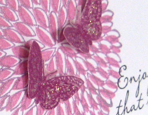
En dit zijn de afgemaakt kaarten. Elke afdruk heeft andere eigenschappen. Een kleine afdruk heeft wat meer nodig aan rand en kleur (linker kaart) De grootste afdruk (kaart rechts) is fors genoeg om een hele kaart te vullen. Ik heb er slechts een tekstje (beterschap) bij gedaan. De middelste afdruk is te klein om een kaart te vullen. De rand was te breed en te wit. Dus heb ik daar een andere achtergrond stempel bij gebruikt: Raindrop Background van Hero Arts. Die laat voldoende wit om de aandacht niet van de focus af te leiden.
Ik hoop dat het duidelijk is. Misschien wil je het nu zelf proberen. Het is een manier om nog meer plezier van je stempels te hebben! Veel plezier!

Here are the finished cards. Each image has its own limits. The small image needed a firm border in color (card on the left) The big image (card on the right) was bold enough to fill a whole card on its own. I only added a sentiment (get well soon). The medium image was too small to fill the card but too large to need a big border. I just filled up the white background space with Raindrop Background, which leaves enough white and doesn't overpower the image in the middle.
I hope you liked this little tutorial. Maybe you will want to try it yourself and get even more different images from your stamps! Enjoy!

even the littlest comment is greatly appreciated!

zondag 8 januari 2012

Een paar kaarten - Just a few cards

Een paar kaarten van de afgelopen dagen:
Just a few cards from the last couple of days:


Enjoy!

even the littlest comment is greatly appreciated!

woensdag 4 januari 2012

Open en Solid Flower

Na de Dogwood in roze kaart zie ik de wereld door een roze bril, geloof ik. Ik kan alleen maar aan roze denken! Dus heb ik de small open en solid flower van Hero Arts maar weer tevoorschijn gehaald. Maar, oh man, wat een toestand om die twee goed uitgelijnd te krijgen! Als iemand een tip heeft om die twee stempels goed op elkaar te krijgen, hou ik me aanbevolen! Ik heb wel 10 misdrukken weggegooid, geloof ik! Uiteindelijk kreeg ik een afdruk die, in mijn ogen, redelijk was gelukt.

After the Dogwood in pink card, 2 days ago, it seems I can only think pink! I dug out the small open and solid flower from Hero Arts. But, oh dear, what a pain to get a good print! If anyone can give me a tip about getting those two stamps lined up , I'd be most grateful! After throwing away like 10 misprints, I finally got a reasonable one.
Fotograferen wil ook niet zo best met die sombere weer hier in Nederland. Ik weet niet of je het zien kan maar de bovenrand is met een randpons bewerkt. De twee vlindertjes zijn geëmbossed op perkamentpapier met wild plum adirondack embossing poeder. Tekst is ook van Hero Arts.

Taking a photo isn't easy nowadays. Because it's almost always overcast and very rainy outside. I don't know if you can see it but the top border has been punnched with a scalloped border punch. Both butterflies are embossed with wild plum adirondack embossing powder on parchment paper. Text stamp from Hero Arts too.
Ik heb een klein beetje diamond stickles op de vleugels gedaan. Met dit depressieve weer kan ik alle bling gebruiken om een beetje vrolijk te blijven!

I applied a tiny bit of diamond stickles to the butterflies. With our depressing weather I can use all the shine I can get!

even the littlest comment is greatly appreciated!

maandag 2 januari 2012

Zachtroze - Pretty in Pink

Hero Arts heeft een nieuwe uitdaging deze maand. Kijk maar eens op hun pagina. De kruisjes en nulletjes (hugs and kisses) deden me direkt denken aan de Dogwood. Het bloemetje is immer precies een kruisje!

Hero Arts has a new challenge this month. Take a look at their challenge page. The crosses and circles (hugs and kisses) reminded me of the Dogwood. That flower looks like a cross!
Bovendien heb ik een leuke serie kleuren brilliance dewdrop inkt. Roze, heel erg roze, purple, blauw en zilver. Past precies bij de kleur uitdaging van Hero Arts deze maand. Ik had een gedeelte van de Dogwood gestempeld voor de bloemen en die afdruk gaf me nog een ideetje.

Besides, I have some Brilliance dewdrop ink in matching colors. Pink, very pink, purple, blue and silver. They fulfill the colorchallenge of this month precisely. I stamped part of the Dogwood three times to get the flowers and those imperfect images gave me another idea.
Een stempel hoeft niet helemaal perfect afgedrukt te worden. Zeker niet als je een zachte kleur gebruikt. Het geeft een dromerig, romantische uitstraling als je de randjes niet inkt. Met deze techniek ga ik nog wat experimenteren denk ik. Ik vind het wel mooi!

A stamped image  doesn't have to be perfect. Especially when using a soft color. It has a dreamy, romantic glow if you don't ink the edges. I think I will experiment further with this technique. I really like it!

even the littlest comment is greatly appreciated!